


Sun's out, spines out!
Giving some love to some lovely book spine designs

I never like to open my paperbacks all the way so my book spines remain pristine, crack-less. It’s a peeve of mine when my books look like they went through seventeen apocalypses and got trampled on by baby zombies. Is this deranged? I mean, it’s part of the book cover! Why neglect it? Why let it bear the brunt of our (physical) reading experience? Hence, my objection to books looking worn (if your books are worn, that’s fine. Just don’t come and crack my books please).
I know I have been giving lots of attention to the front faces of book covers, so let’s shine some light on some spines. Instead of outlining what makes some of these book spines great, I’m just going to let them do most of the talking.
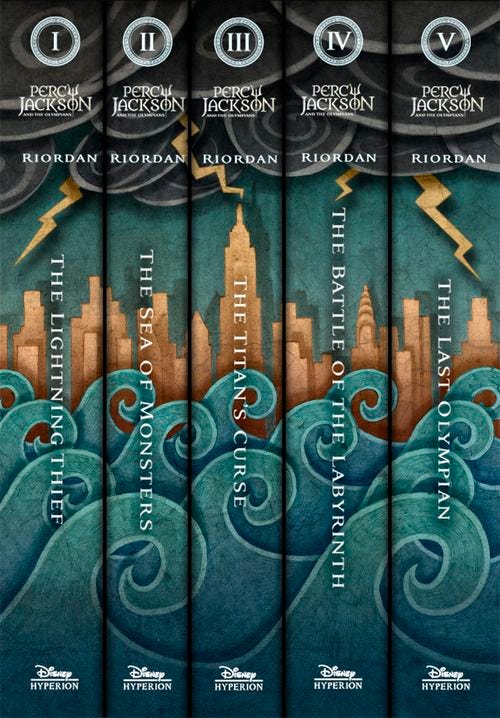
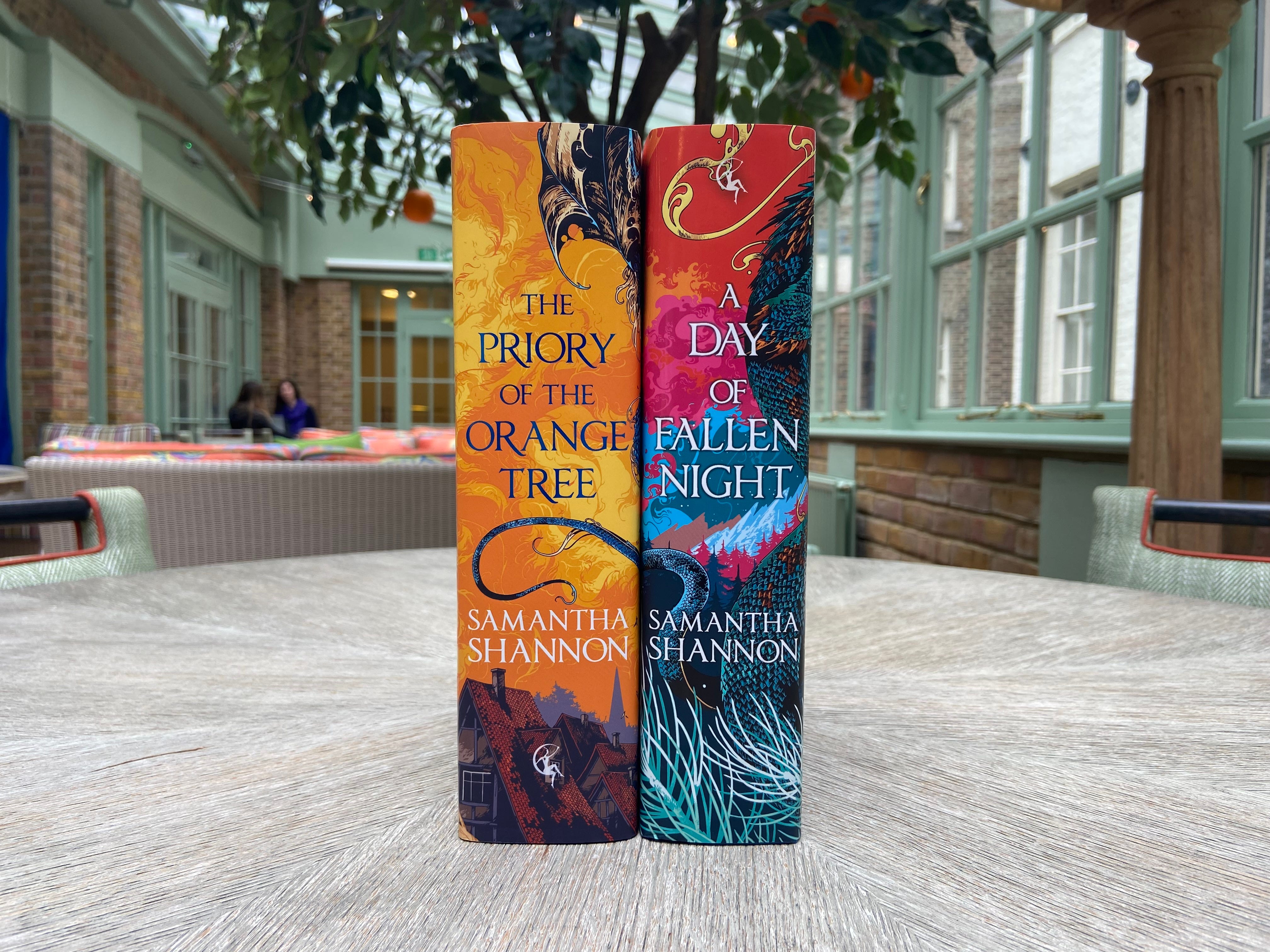
I mean, why should I ramble for a paragraph when you can see, say, book cover spines that line up and form a whole illustration…1
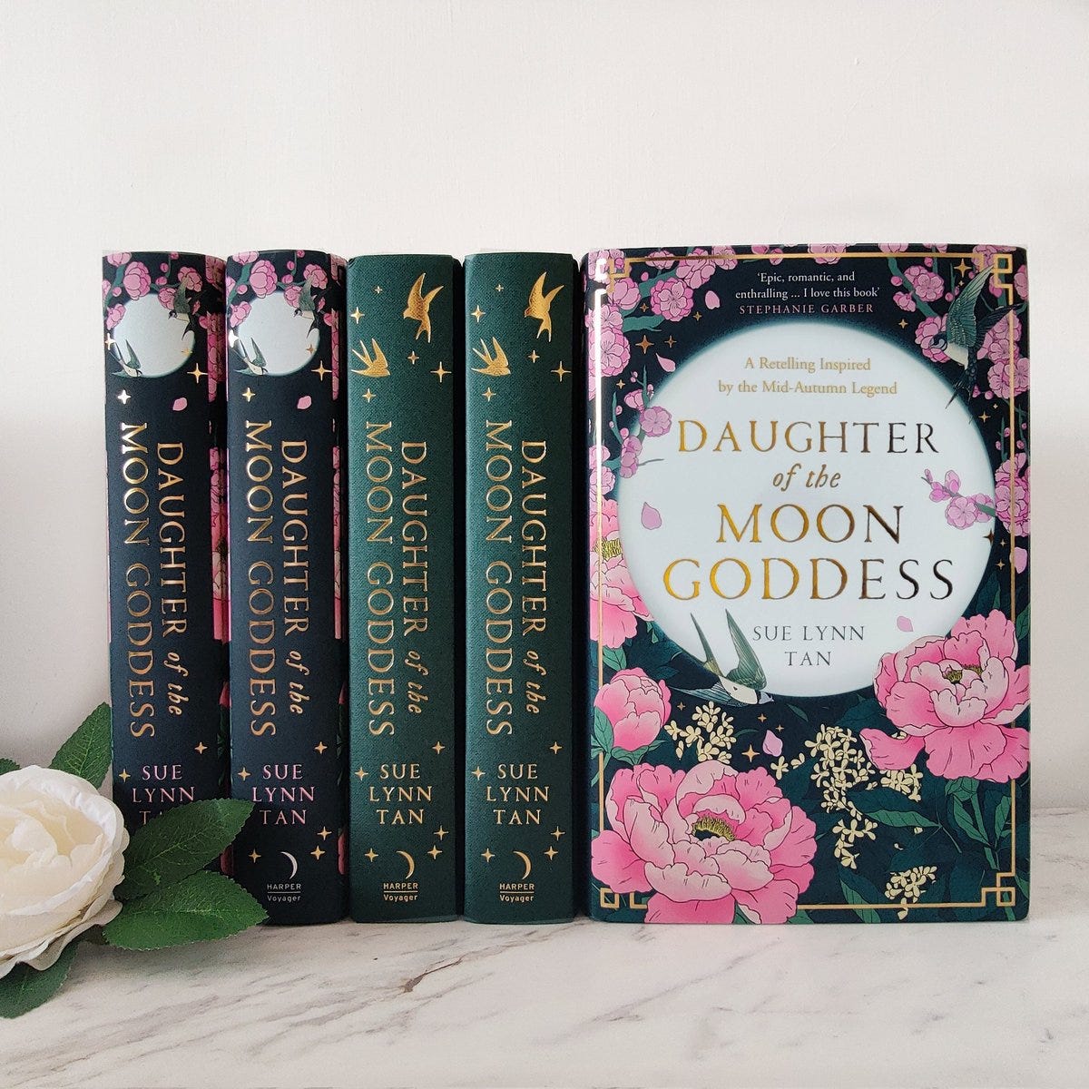
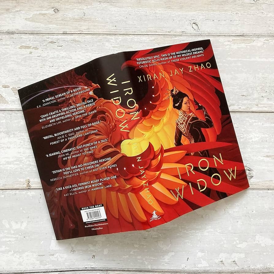
Or when the jacket and embossed hardcover have identical details…2
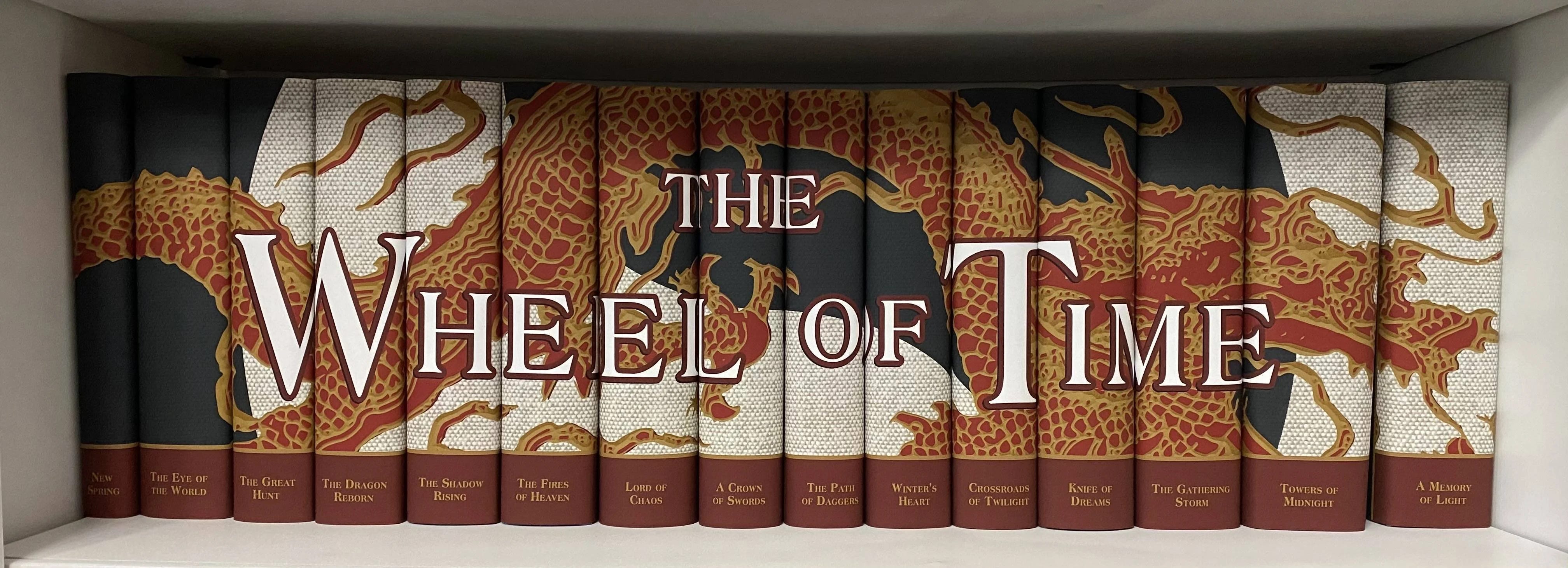
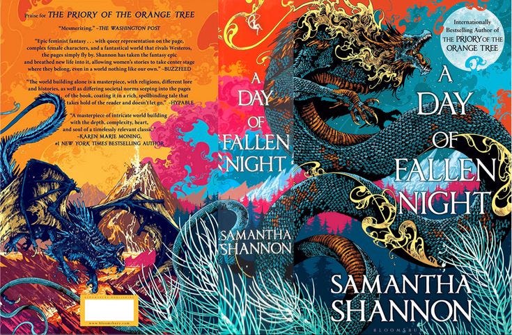
Or when books from the same author have colours that meld together in a beautiful ombre…3

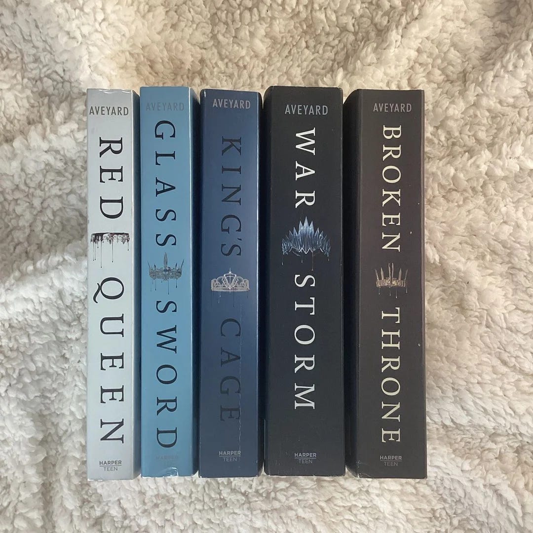
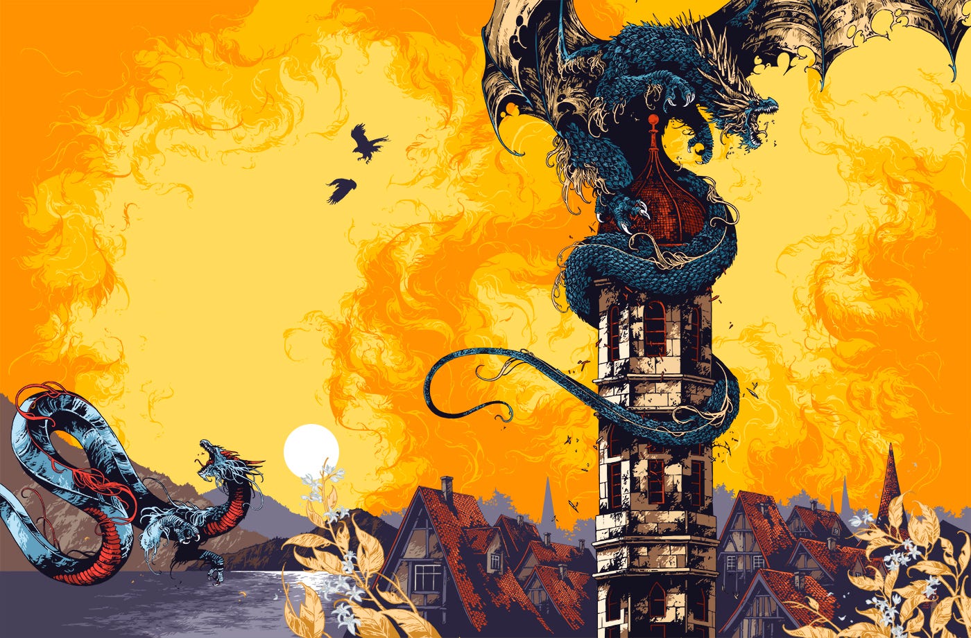
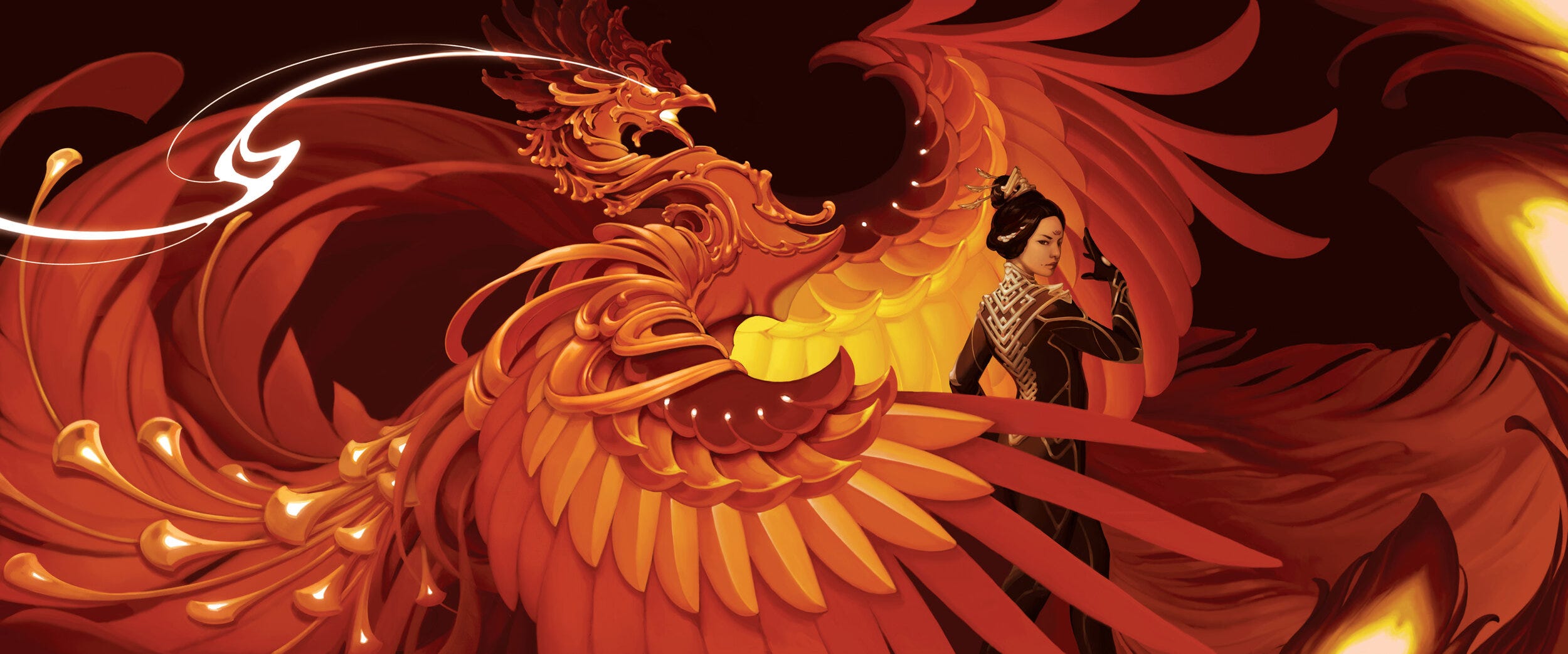
Or when the design wraps around the entire book and the face continues over to the spine…4
Umm…Ivan Belikov’s portfolio page for TPOTOT cover is to DIE for!
So much to look at! And all to be caressed and hidden behind your hands.
When they are the only side of the book you see on shelves, they do so much of the heavy-lifting of grabbing your attention. What are some book covers with some great posture spines?
Remember to care for your book spines…don’t crack them too hard, if you can (or better yet, at all!)
Until next time~
https://www.reddit.com/r/oddlysatisfying/comments/iz7q5h/i_know_some_of_yall_enjoy_when_the_spines_of_a/
https://x.com/SuelynnTan/status/1484136384604479493
https://www.instagram.com/elimpix/ ——— https://pangobooks.com/books/ad6da22b-68a7-40c7-80be-9e39baf006b6-ixxcBsymGfX9cLegjkLuCAoocWv1
https://x.com/BloomsburyBooks/status/1632719074538008577