


Understanding book cover redesigns: examining "Her Radiant Curse"
Let's compare the old and new US book covers of the standalone fantasy novel by Elizabeth Lim (Knopf Books)

(US editions) Illustrator: Tran Nguyen (Instagram | Website). Lettering artist: Alix Northrup (Instagram)
(UK editions) Graphic designer: Lydia Blagden (Instagram). Illustrator: Kelly Chong (Instagram | Website)
For consumers, book cover redesigns may mean a new visual to fawn over or be attached to. For publishers, book cover redesigns are marketing moves to better sell a book.
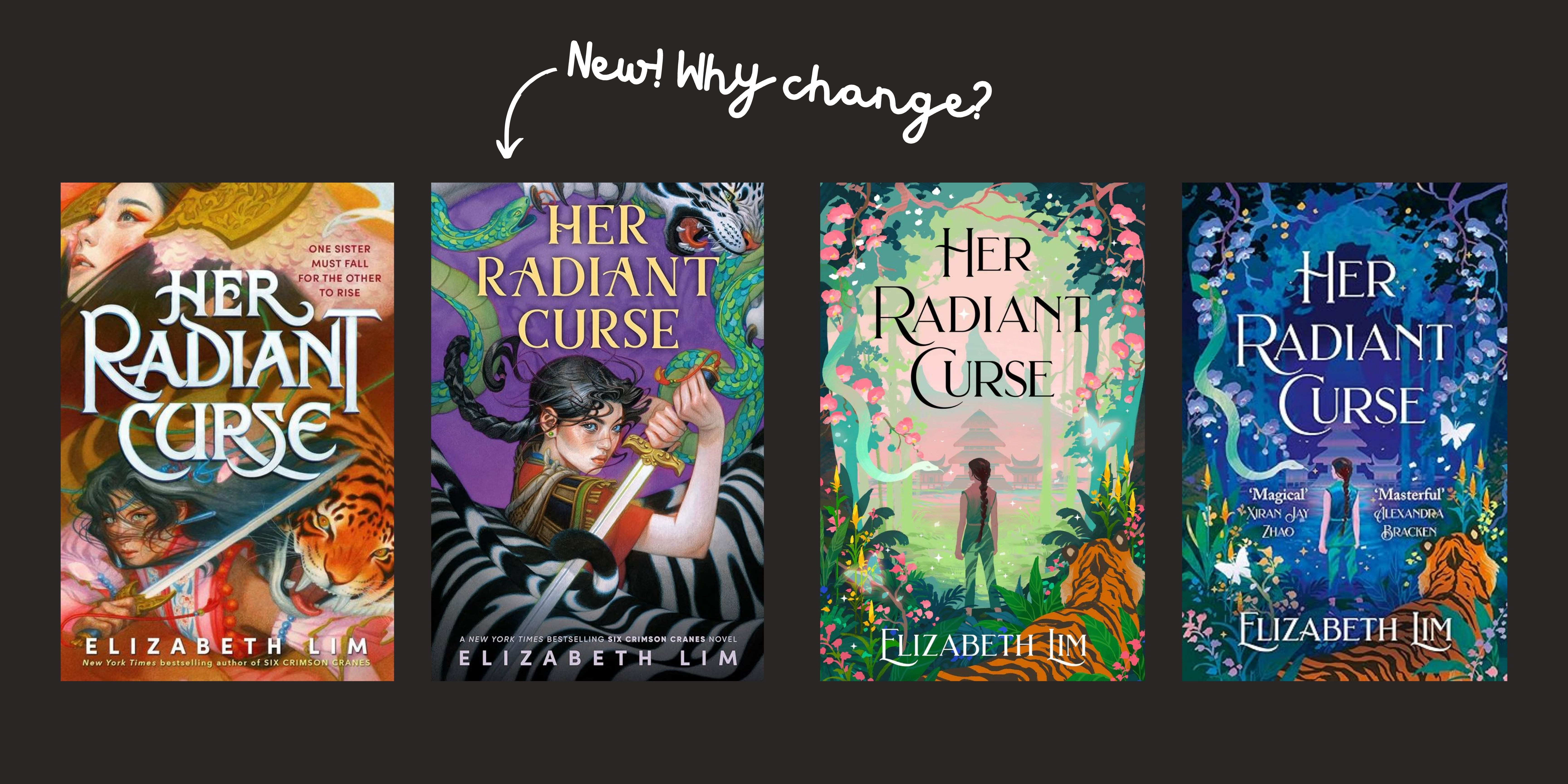
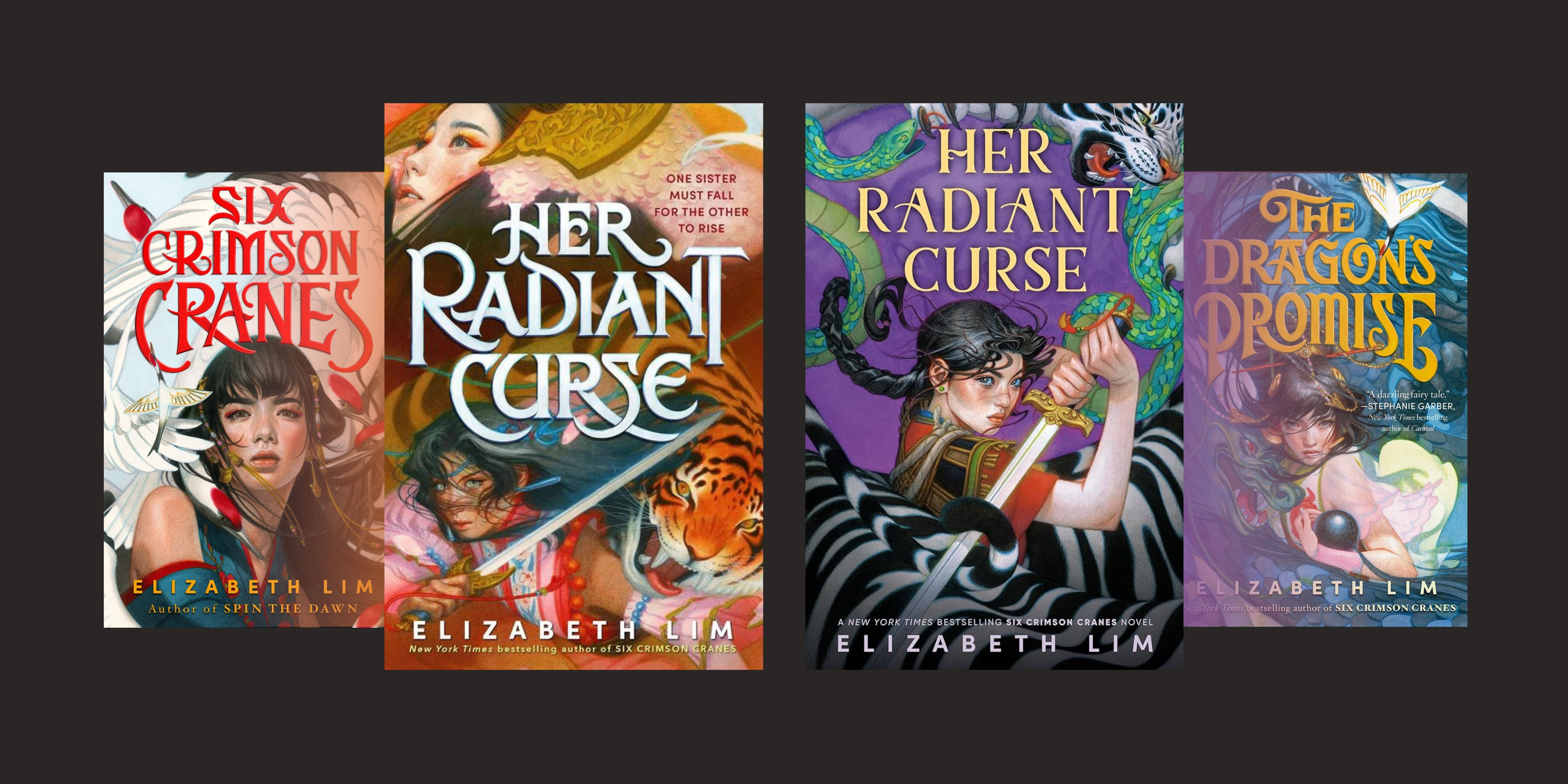
Back in late August, Elizabeth Lim surprise revealed a new cover for Her Radiant Curse, a 2023 standalone installment, in her Six Crimson Cranes duology (Six Crimson Cranes, The Dragon’s Promise). The fantasy series is geared for young adults and tackles its covers with an illustrative approach. I’m a fan of her work, hence this circulated on my feed pretty quickly and got me thinking.
What’s new?
The new cover centres on Channi and brings her closer to the viewer, allowing us to pay more attention to her youthfulness and fierce gaze. Suffice to say, there’s less ambiguity in determining who is Channi in the new cover compared to the old. The hair and the colour scheme are more evocative of the UK (Hodderscape) standard cover, particularly the newer second colour variation announced in April 2024, where blues and purples replace the pink and green.
Why the change?
What does that mean?
Let’s take the literal, visual approach: the publisher wanted to convey a youthful, empowering heroine at the forefront. The redesign centres the heroine (Channi) and makes her the main focal point much like how Shiori was for SCC and TDP, creating consistency. On a side note, the fantasy elements are composed similarly, with animals (or a dragon alone) framing the heroines.
But…why? What does the change do?
Perhaps, it was thought the original cover, though visually stunning, might skew towards attracting an older audience and might’ve been reevaluated to be hard for readers to interpret, creating a disconnect between the cover, the story, and the audience.
Perhaps, seeing that the UK cover did much better in sales, they identified that it may be due to the cover’s comparative accuracy and clarity in conveying the focus and tone of the story. As such, they decided to commission another cover from Tran Nguyen for HRC to make the US cover look like its UK counterpart.
The new cover realigns expectations and may better attract younger audiences who would interpellate and relate to the more explicitly-empowered, young heroine.
At the end of the day, book covers in context are marketing efforts and, therefore have a business purpose: to sell the book. It needs to be effective. If publishers believe redesigning a cover would help, it may, if done right and is assessed to be truly required.
Regardless, do you have any thoughts on the new paperback cover? Is this redesign an improvement?
Until next time!
P.S. Dearest Knopf, the original title treatment for HRC beats the new one any day, even though I could reason why the original title wouldn’t fit into the new cover’s composition. How could you give up the knife hidden in the ‘R’ of ‘Curse’ and the way the ‘S’ looks like a snake? A sad loss for the lettering artists out there.