


My Top 5 Covers of April 2025
We are going to magical and creepy places~
I’m not fooling around here, because this month features one of my highly anticipated books of the year. Now sit tight, relax, and scroll away~
Note: presume that I have not read any of these books unless I’ve indicated as such. Any observations made about the story the covers represent and its quality are only based on the synopses and the cover. Also, these covers are not in any order!
#1
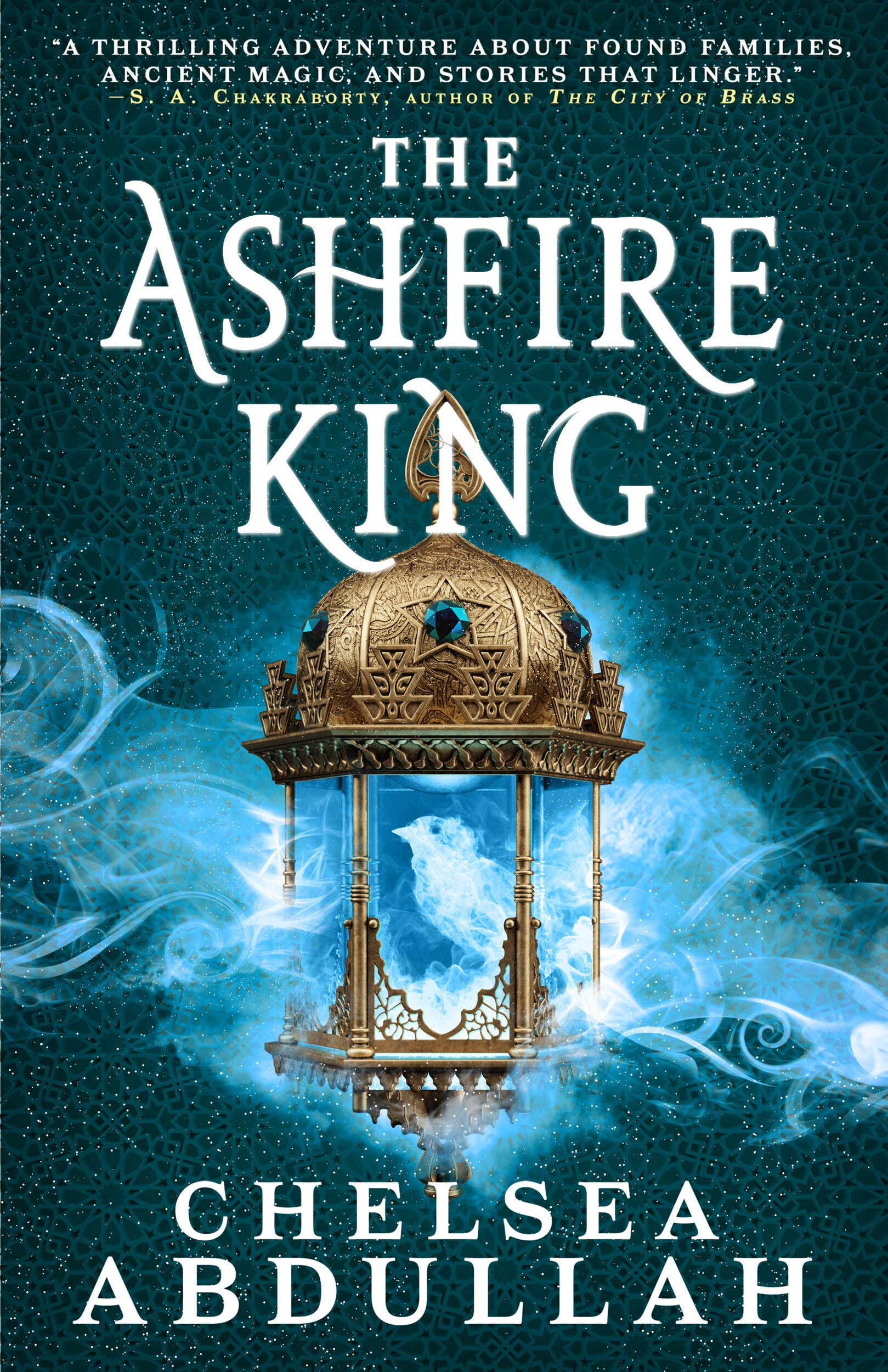
Sequel to the THE STARDUST THIEF and Book 2 of the Sandsea Trilogy
Book Cover Designer: Lisa Marie Pompilio (Website)
Lisa has also designed these amazing books:
The Ten Thousand Doors of January by Alix E. Harrow
Sistersong by Lucy Holland
Kaikeyi by Vaishnavi Patel
Book Cover Illustrator: Mike Heath (Art Station)
Mike has also illustrated:
The Foxglove King by Hannah Whitten
The Light at the Bottom of the World by London Shah
Unearthed by Amie Kaufman & Meagan Spooner
The BIRD! *send tweet*
No, no, but seriously though. I’ve been sitting on this particular cover writeup for A YEAR. It’s a nice transition from the first novel where the cover is white and orange. Here it’s dark teal and blue, allowing for some complementary contrast. The smoke is a nice visual motif that ties the covers together, which is always nice to see. The lantern is beautifully rendered and also contrasts the blue tones with its brassy tones. Perhaps the darker palette also hints at the story’s ventures into darker territories…and maybe quite literally as the last novel left us with Louie about to head into an ancient, hidden jinn city.
Having read the e-ARC, oh ho ho. This cover alludes to the story’s worldbuilding and a beloved character (to me, at least). Q****, you’re so loved.
#2

Book Cover Designer/Illustrator: unknown
I like how the sense that things are slightly off is conveyed through the minimalist surrealism of a sun-like orb floating above the valley, while the rest bends around the photo. It evokes Chip Kidd’s work with Haruki Murakami’s covers in English: the all-caps sans serif typeface that isn’t thin but not thick either, the slightly eclectic composition, a prominent circular element. That may be the visual allusion this cover evokes, but that’s just my guess.
#3
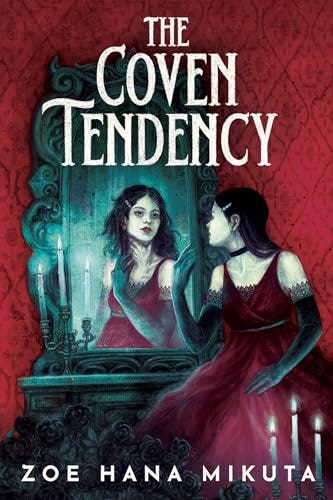
Book Cover Designer: Zareen Johnson (Instagram | Website)
Recognise any of these titles Zareen designed for?
The Undead Truth of Us by Britney S. Lewis
Serwa Boateng’s Guide to Vampire Hunting by Roseanne A. Brown
The Dark Becomes Her by Judy I. Lin
Book Cover Illustrator: Jana Heidersdorf (Instagram | Website)
Oh hello! A new name but not one with an unrecognizable style! Recognise any of these titles?
Don't Let the Forest In by CG Drews
Hazel Thorn by CG Drews
Chlorophilia by Cristina Jurado, translated by Sue Burke
It’s the creepy hand wrapped around the MC’s neck in the mirror. It’s the wine-red and turquoise pairing that creates an uneasy atmosphere. It’s the custom typeface treatment for the title, where the vertical feet remind me of the bumped ends of cartoon bones. Just…mwah!
#4
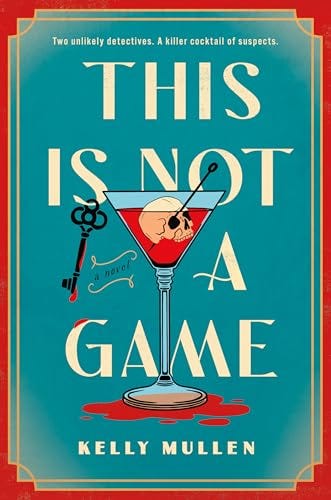
Book Cover Designer/Illustrator: unknown
Another murder amongst socialite circles, gotchaaa. Having a skull replace the olive in a martini is simply playful while being a surprise in it of itself; imagine reaching for a drink and suddenly seeing that inside. The complementary colours grabs attention, especially with the not-so-shy use of red from top to bottom.
#5
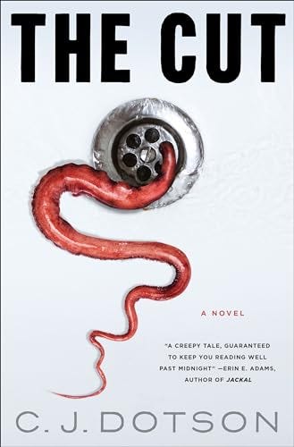
Book Cover Designer: Olga Grlić (Instagram | Website)
Okay! I didn’t know your game, Ms Olga. She has a lengthy portfolio, having contributed to the covers of books like:
Eleanor & Park by Rainbow Rowell
Our Infinite Fates by Laura Steven
Escape into Meaning by Evan Puschak
Exhibit A: the power of a good visual. It takes the normal and gives it a twist. Letting it do the talking and having the text not compete is enough to create an attention-grabbing cover. The immense ick one gets at the visual of some slimy wiggling thing creeping up from the drain hole does wonders for attention, projecting the story’s genre in a heartbeat while attracting curiosity: what on earth is that?
Honorary mentions
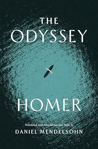
Book Cover Designer: unknown
Book Cover Illustrator: Monograph Studio (Instagram | Website)
Again: a strong but simple visual can do the talking! The tiny boat floating in the expansive sea poignantly represents Odysseus’s journey to go home from war.
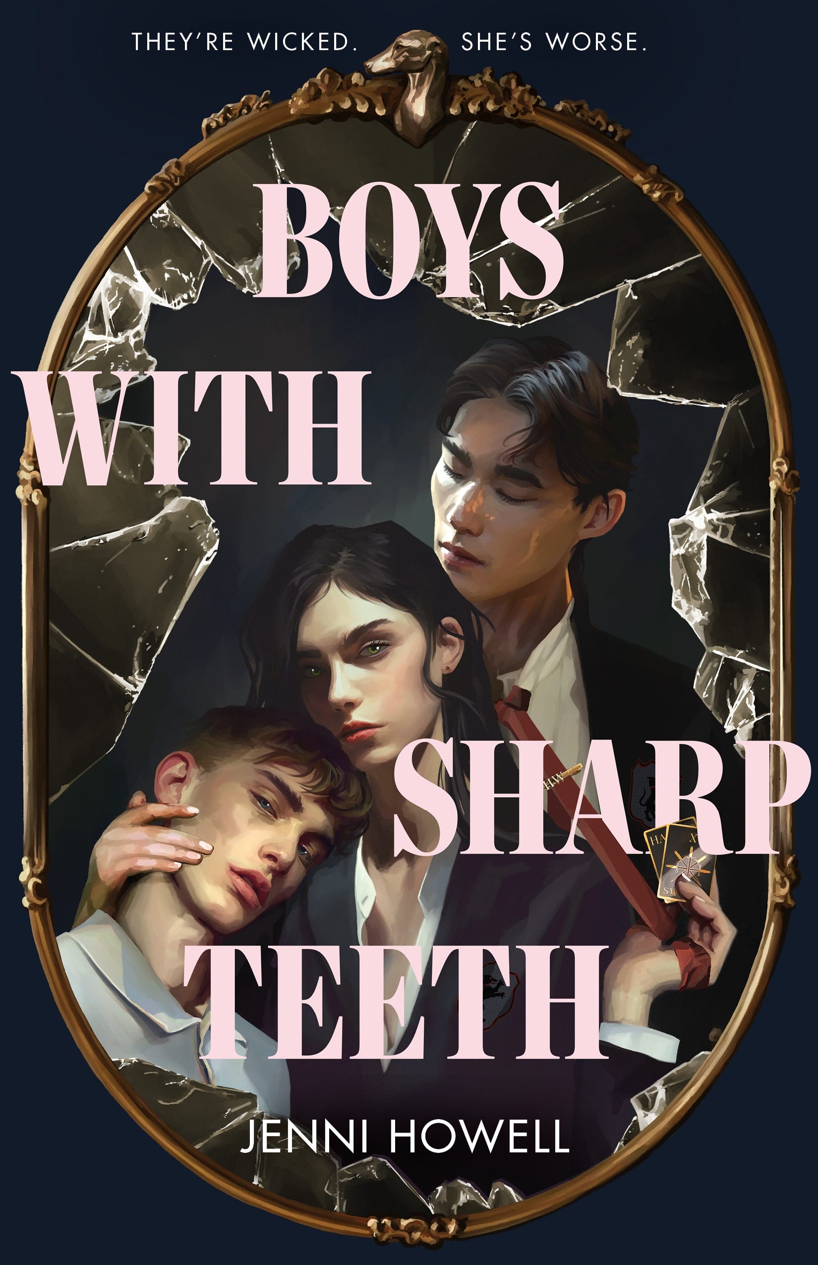
Book Cover Designer: L. Whitt
Book Cover Illustrator: Colin Verdi (Instagram | Website)
A familiar illustrator, Colin has also done:
Better Left Buried by Mary E. Roach
In Nightfall by Suzanne Young
The Death of Jane Lawrence by Caitlin Starling
The *lighting*. The rendering (I’m a sucker for most types of semi-realism). The delicate baby pink font colour balances out the dark-academia navy blue, white, and red palette. The direct stare of 2 of 3 of its characters is more than enough to beckon scrolling social media users or browsing readers in stores to feel they are directly addressed to and pick up the book.
That’s a wrap for April!
What do you guys think of these covers? What are the books you’d put on your top 5 for April 2025?
Now, back to our normal schedule. Next: top 5 for May. (Oh my god we’re entering the second-third of the year or halfway through Q2).
Until next time!